Table of Contents
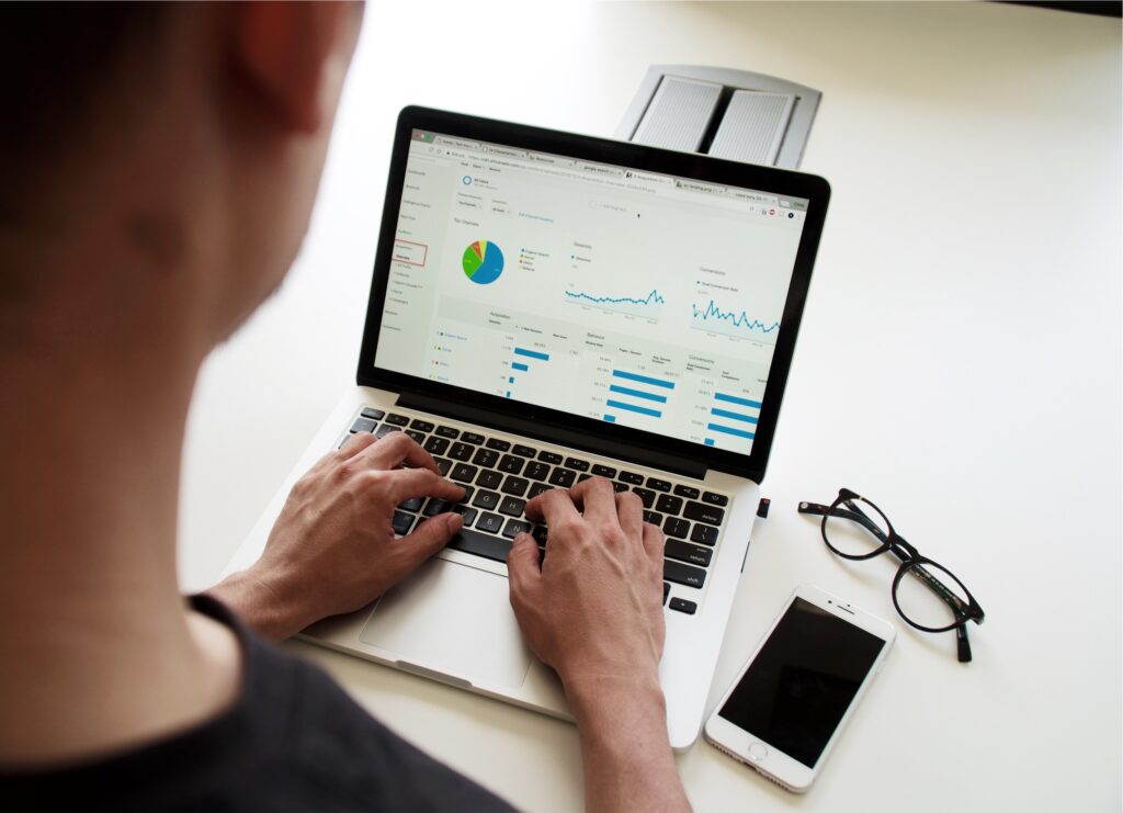
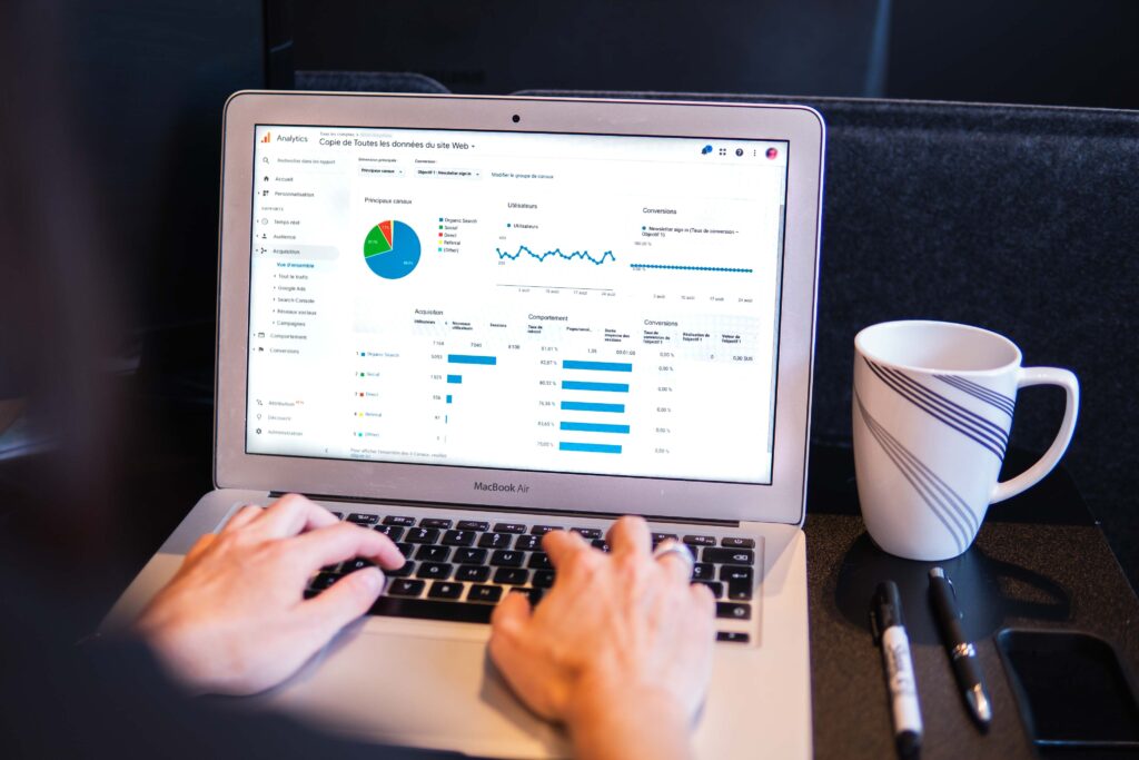
Each time your staff enters an order and swipes a credit card, your cloud-based POS system creates data. While data analytics in restaurants may not tell you much on their own, in aggregate, they reveal a great deal about your business.
So how do you make the most of it?
Only 12% of analytics companies for restaurants leverage the power of data, although using analytics can increase profits by 8% to 10%.
Data analytics for restaurants can seem daunting. However, understanding them is crucial to your operational and financial literacy as a restaurateur. A modern POS system will present restaurant owners with metrics like the number of times an extra ingredient was requested.
You might miss out on a significant amount of revenue if you only increase or decrease the stock for that ingredient after looking at the data.
We at jalebi.io have designed our smart platform to help you make sense of all that information. Our platform lets you see your entire operation, vertically anchored with inventory management.
What is Big Data in Restaurants?
Big data is an important asset to large chain restaurants, providing them with insights from their inventory management software, payroll management, website, and social media.
This data can help chains identify customer trends and align marketing strategies accordingly. It can also provide valuable feedback on the efficiency of operations. For the average independent restaurant, however, big data is less likely to be a focus due to its larger-scale nature and lack of resources for collection and analysis.
Smaller businesses should instead focus on collecting data relevant to their day-to-day operations such as customers’ orders, feedback or complaints, menu changes, specialty offerings, etc. This real-time data can inform immediate decisions like cutting back menu items that rarely sell or adding in new specials that get more attention from customers.
Collecting this type of data will provide more dependable information that small businesses can use in order to make better decisions moving forward and maintain a competitive edge in the market.
What are restaurant analytics?
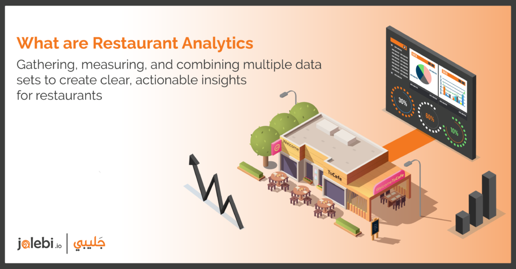
Restaurant analytics involves gathering, measuring, and combining data to uncover clear insights.
They go beyond simple reporting by diving deeper into the meaning of the numbers.
With restaurant analytics platform, you can understand the full story of your restaurant. This is especially valuable for owners of multiple restaurants or chains.
Instead of searching in multiple places, restaurant analytics provide a single source of truth. This saves time and can increase profits.
By analyzing the data, you can identify what drives profitability and what holds it back.
This information allows you to make operational adjustments, manage inventory, train employees, optimize menus, and improve customer interactions.
In today’s challenging times, restaurant delivery analytics are even more crucial. They can help you enhance your takeaway and home delivery services.
Refining these offers based on insights from the data can attract more customers and increase your success.
Why should you use restaurant analytics?
Using analytics in a restaurant can provide immense benefits to gaining insight into customer patterns and preferences, increasing efficiency, and optimizing operational performance.
By gaining a better understanding of their customer’s behaviors and needs, organizations can make wiser decisions that lead to improved profitability.
In turn, this gives restaurants an edge in providing stellar service and ensuring customers have an enjoyable experience when they eat at the restaurant.
Thanks to cloud-based point-of-sale systems, restaurants can track every transaction they conduct at any given moment.
This data gives them valuable insight into how many people come in for meals on specific days or times, what dishes are frequently ordered, and how well these dishes perform financially.
All this knowledge will help the restaurants plan for future scenarios such as implementing new menu items or altering promotional strategies that take advantage of seasonality or local events.
Additionally, by leveraging greater insights from this data with predictive analytics tools like machine learning models, it is possible to anticipate customer behaviors which lead to more successful outcomes.
Benefits of Using Restaurant Analytics
The restaurant industry is at the forefront of taking advantage of analytic data to improve services and provide a better customer experience.
With the use of sophisticated analytics, restaurant owners can gain insight into factors like customer preferences, operational efficiency, trends in consumer behavior, and much more.
By collecting data on every aspect of their business operations from start to finish, restaurants have access to a deeper understanding of their customer base and can adjust according to what will best benefit them.
Not only does restaurant analytics help restaurants improve their service, but it also provides a more personalized experience for customers as well.
Analytics allow for early detection of anomalies that could indicate food safety issues or system malfunctions before they become an expensive problem. They provide near-instant feedback on products and services that customers don’t know they need until they try them out.
And by tracking purchasing behaviors down to the individual table level, restaurants can personalize menus and specials to ensure each guest leaves satisfied.
In addition, data analysis can be used to tailor marketing campaigns based on geographical location or seasonal tastes so restaurants are targeting customers within their local community with more accuracy and ease than ever before.
How do restaurants collect data?

Restaurants collect data from customers in various ways. Point-of-sale (POS) systems are one of the most popular methods used, as they capture sales and customer information for each transaction at checkout.
Online ordering platforms also allow restaurants to gain actionable insights about their customers, including when and how often they order, as well as what types of items they typically purchase.
Additionally, table reservation systems help restaurants track guests’ preferences for seating arrangements and available timeslots in advance.
Lastly, customer relationship management (CRM) systems enable restaurant operations teams to segment their client base according to a variety of criteria such as age, gender, or number of visit frequency.
This gives restaurants the ability to tailor their marketing efforts and services accordingly to meet customer needs more efficiently.
Overall, these strategies help restaurateurs design effective marketing plans that can result in increased profits and better overall customer experiences.
With an abundance of data available through these sources, restaurant owners can easily analyze past trends to inform future decisions that will maximize success within the industry.
Collecting data allows businesses to gain a deep understanding of their customer’s specific needs and interests so they can deliver on those demands for a memorable dining experience which could lead them toward continued success and prosperity.
Visibility Across The Business
Combining all your data sources gives you a better understanding and more visibility over your business.
– Tracking customer and review data helps you know the social sentiment at all times.
– Alerting your managers or team members to negative reviews as soon as they come in can help address issues quickly.
– You can also keep an eye on your different channels, such as delivery, takeaway, and eat-in, and see how much revenue each brings in. These channels are no longer just optional extras, they need to be taken seriously with their own requirements.
– Understanding your delivery demand allows you to optimize your menu for delivery, ensuring it withstands being in a container for up to 30 minutes.
– Proper staffing in the restaurant can help handle both deliveries and eat-in orders smoothly. As your business grows to multiple locations, benchmarking becomes important.
– Comparing metrics like average transaction size or attachment percentages of sides or desserts can help determine which locations are performing the best and where improvements are needed. Access to benchmarking can accelerate your path to success.
What are the 4 aspects of data analytics?
Data analytics involves various aspects that collectively contribute to extracting valuable insights and knowledge from data. Here are the four key aspects of data analytics:
Descriptive Analytics
Descriptive analytics involves analyzing historical data to understand what has happened in the past. It focuses on summarizing and presenting data in a meaningful way to provide insights into trends, patterns, and outliers. This aspect helps in gaining an understanding of the current state and past performance of the organization or system.
Diagnostic Analytics
Diagnostic analytics involves identifying the reasons behind past events or trends. It aims to determine the factors that contributed to a particular outcome or pattern by analyzing historical data. This aspect delves into causality and relationships within the data, helping to understand why certain events occurred.
Predictive Analytics
Predictive analytics involves using statistical algorithms and machine learning techniques to forecast future outcomes based on historical data and patterns. It leverages patterns, trends, and relationships to make informed predictions about potential future events. Predictive analytics is crucial for proactive decision-making and planning.
Prescriptive Analytics
Prescriptive analytics involves recommending actions or decisions to achieve a desired outcome or optimize a particular objective. It suggests the best course of action based on predictive models and simulations, considering different scenarios and constraints. This aspect helps organizations make informed choices by weighing the potential impacts of various decisions.
How does customer analytics for restaurants work?
Data collection
The first and most important step in any customer analytics for restaurant strategy is data collection.
Businesses need to begin by gathering all available customer information, such as purchase history, website visits, demographics, feedback platforms, and surveys.
Capturing the right data is vital for accurate customer analytics for restaurants down the road.
Targeted Marketing Campaigns
With a better understanding of their customer analytics for restaurants and target audience, businesses can create targeted marketing campaigns that effectively grab attention.
Once the data is collected, businesses will need to develop an effective way to analyze it. This includes understanding which trends are significant when interpreting large datasets.
For example, if a business finds that its customers typically show interest in specific promotional offers, it can tailor their ads accordingly so they catch people’s eye more easily.
Discount offers
They could also consider adding features or discounts based on usage patterns or other behavior triggers in customer analytics for restaurants.
By implementing these insights into their strategies and operations, businesses can better serve their customers while gaining a competitive advantage in the long run.
Let’s explore data analytics in restaurants a bit further.
Sources of Data in a Restaurant
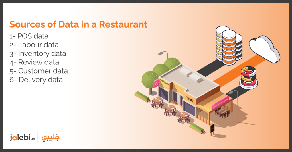
Several types of data streams are important for a restaurant. You don’t need all of them, but they do become more useful with time.
1. POS data
Your point-of-sale system (POS) gathers all your information about sales you’ve made. With a modern, cloud-based POS system, you will be able to gather very granular data. This can be seen as transactional data, tip size, discount added, order type, and more. As a result, you can analyze each and every sale in great detail to optimize your every step.
2. Labour data
The next thing to consider is your staff scheduling system. This relieves the bottleneck of paper schedules as it allows you to schedule shifts, communicate with your team, set up payroll, and more. You will be able to view the amount of labour scheduled for every hour of the day as a result of scheduling this way – a digital timesheet for your entire organization.
3. Inventory data
By connecting your inventory (stock) system to your point-of-sale (POS) and adding all your recipes, you can keep a check on exactly how much of each ingredient is being used, where it is coming from, and when it needs to be replenished. In addition to keeping track of food waste, inventory data can be used to reduce it.
Using these systems, you’ll be able to see the three most important elements of your business’s operational side. You can generate the most valuable reports for your business if these data sources are fed into an analytics system.
4. Review data
Customer reviews from all different review sites are a great way to understand how good your service is and where it needs to be improved. Considering the sheer amount of different review platforms, it can be difficult to keep track. It is possible to compare reviews across different sites and see trends by bringing them together.
5. Customer data
Customer data can then be included, such as how many times a customer visits your restaurant, what they order, how large their transactions are, and so on. Depending on your business type, loyalty programs, reservation software, and restaurant apps can be used to accomplish this.
6. Delivery data
When you know your most popular delivery platforms, what menu items are most popular per platform, and how fast your delivery times are, you can determine what to promote or where to offer deals.
All of this can be made possible with the help of restaurant delivery analytics.
7. Sources of additional data
The above data types are the usual suspects in running a restaurant business. Still, you may also have custom data sources such as footfall, wifi connections, or turn-style data that would allow you to analyze trends. In addition, competitor data such as comparable prices and reviews can help you benchmark your business against others in your niche.
5 Unique Ways To Generate Revenue Using Analytics For Restaurants

There are many different ways to generate revenue using analytics for restaurants.
By understanding and utilizing data, restaurants can identify opportunities to increase sales and profits.
Here are five unique ways to do so:
1- Use Data To Understand Your Customers Better
51% of customers would never do business with a brand if they had a bad experience with it once. As a restaurant owner, you are always looking for ways to increase revenue and improve your business.
One way to do this is to better understand your customers. By using restaurant customer analytics to analyze your customer base, you can identify trends and make changes that will appeal to them.
For example, let’s say you notice that a lot of your customers are ordering delivery during the weekdays.
You could use this information to make changes like adding more delivery options or promoting weekday specials.
Alternatively, if you notice that most of your customers are young families, you could adjust your menu to include more kid-friendly options.
Making small changes based on customer data can have a big impact on your business. It can help you attract new customers and keep existing ones coming back.
So if you’re not already using restaurant customer analytics your customers better, now is the time to start!
2- Use Data To Optimize Your Menu
As a restaurant owner, you know that offering a great menu is essential to attracting and keeping customers. But did you know that you can use data to optimize your menu and increase your revenue?
By analyzing customer ordering data reports, you can identify which dishes are the most popular and make sure they are prominently featured on your menu.
You can also identify which items are not selling well and consider removing them from your menu or promoting them more aggressively.
In addition, you can use data to help you set prices for your dishes.
By looking at cost data and customer ordering patterns, you can ensure that you are charging a fair price for each dish while still maximizing your profits.
So don’t just rely on your gut when it comes to your menu – use data reports to make informed decisions that will help boost your bottom line.
With jalebi’s restaurant analytics software, you can provide a universal menu for your restaurant. This means that you can have one menu for all of your locations, making it easier for your customers to find what they want.
3- Use Data To Improve Your Operations
Data can be used to improve just about every aspect of your restaurant operations.
- Want to increase sales? Use data to figure out which menu items are selling well and which ones aren’t.
- Want to improve guest satisfaction? Use data to track customer feedback and identify areas where you need to make changes.
By understanding how your restaurant is being used, you can make changes that will improve overall operations and help boost profits.
4- Generate Forecasts
If you’re not using data analytics to forecast trends for your restaurant, you’re missing out on a huge opportunity to generate revenue.
By understanding what your customers are likely to order in the future, you can make sure you have the right mix of ingredients on hand and avoid any costly last-minute purchases.
Not only will this save you money, but it will also help you to better manage your inventory and reduce food waste.
Analytics can also help you identify opportunities to introduce new menu items that will be popular with your customers.
So if you’re not already using data analytics to inform your decision-making, now is the time to start. Your bottom line will thank you for it!
If you’re looking to forecast trends for your restaurant, jalebi’s sales data visualization feature is a great tool. With it, you can see how your sales have been performing over time and identify any potential trends.
5- Use Data To Develop New Marketing Strategies
One way to do this is to use restaurant data to create targeted marketing campaigns that appeal to specific demographics.
For example, if a restaurant knows that its target market is young adults between the ages of 18 and 34, it can use data collected from social media and online reviews to create a marketing campaign that specifically appeals to this demographic.
Additionally, by analyzing customer spending patterns, restaurants can identify opportunities to upsell or cross-sell certain menu items.
How To Analyze Restaurant Data With Restaurant Data Analytics Software
Analyzing restaurant data set by using restaurant data analytics software can provide invaluable insights about customers and enhance overall business performance.
– To begin the process, it is essential to set up a system to collect and curate data points from various sources. This includes restaurant point-of-sale analytics, customer loyalty programs, third-party review sites like TripAdvisor or Yelp, online ordering systems, as well as feedback forms and surveys sent out directly to customers.
– Syncing all these systems into one platform can help aggregate and present data in an easy-to-read format. This way important metrics such as sales reports, customer lifetime value scores, customer segmentation details, etc., will be easily accessible from one place. The presence of these metrics tends to be customizable according to what information needs to be measured or made visible.
– With a good data capture setup combined with automated reporting mechanisms, it becomes easier to identify trends over time and also find cost reduction opportunities for operational efficiency or optimizing marketing strategies.
– In addition, continuous tracking of customer feedback is essential for maintaining high standards of service quality which has great ROI potential for restaurants.
Partner With jalebi’s Restaurant Analytics Software
Are you looking for a game-changer in the world of restaurant management? Look no further than jalebi’s restaurant analytics software!
With jalebi as your trusted partner, you’ll gain access to a powerful tool that will revolutionize the way you make decisions for your restaurant.
Imagine having the ability to make insightful, data-driven decisions at your fingertips. Jalebi’s restaurant data analytics services offer a wealth of features designed to provide you with a deep understanding of your restaurant’s performance.
- Visualize your sales data like never before, uncovering valuable trends and patterns that can help you identify opportunities for growth and optimization.
- But jalebi doesn’t stop at just sales data. This cutting-edge restaurant data analytics software enables you to gather granular information about every aspect of your restaurant’s operations.
- From tracking inventory levels and monitoring customer feedback to analyzing labor costs and calculating cash flow, jalebi’s analytics software for restaurants has it all covered.
The insightful reporting feature offers detailed reports that provide a comprehensive view of your restaurant’s performance, empowering you to make profitable decisions with confidence.
Contact Us For jalebi’s Restaurant Data Analytics Services
Partnering with our restaurant data analytics services can revolutionize your business. By harnessing the power of data, we empower you to make informed decisions that drive growth and profitability.
Our team of experts will work closely with you to understand your unique goals and challenges, tailoring our services to meet your specific needs.
Whether it’s uncovering customer preferences, optimizing your menu, or streamlining operations, we provide actionable insights that can take your restaurant business to the next level. Don’t wait any longer to unlock the full potential of your restaurant.
So what are you waiting for? Contact us today to see how our restaurant data analytics services take your restaurant business to the next level.
Frequently Asked Questions
1. What are restaurant predictive analytics?
Restaurant predictive analytics refers to the utilization of data analysis techniques and statistical models to forecast future trends, patterns, and outcomes within the restaurant industry.
By collecting and analyzing vast amounts of data, such as customer preferences, sales history, weather patterns, and social media sentiments, restaurant owners and managers can make informed decisions about menu planning, pricing, inventory management, and marketing strategies.
Restaurant predictive analytics allows businesses to anticipate customer demands, optimize operational efficiency, and enhance overall profitability.
2. How do restaurant analytics and reporting enable better performance?
Restaurant analytics and reporting play a pivotal role in enhancing the performance of restaurants by providing valuable insights and data-driven decision-making.
By leveraging restaurant analytics and reporting tools, owners and managers can gain a comprehensive understanding of various key performance indicators (KPIs), such as sales, customer satisfaction, table turnover rates, and employee productivity. These analytics provide a clear picture of the restaurant’s strengths, weaknesses, and areas for improvement.
Through regular monitoring and analysis of these KPIs, restaurant operators can identify trends, spot opportunities, and make informed adjustments to their operations, such as menu modifications, pricing strategies, and staffing optimizations.
3. What are the 4 pillars of data analytics for restaurants?
- Sales and Revenue Analysis
Data analytics allows restaurants to delve deep into their sales and revenue data, providing insights into sales trends, peak hours, popular menu items, and customer preferences. By analyzing this data, restaurants can optimize their menu offerings, pricing strategies, and promotional activities to maximize revenue and customer satisfaction.
- Operational Efficiency
Data analytics helps restaurants streamline their operations by analyzing various metrics such as order processing times, table turnover rates, and labor costs. This allows them to identify bottlenecks, optimize staffing levels, improve workflow processes, and enhance overall efficiency.
- Customer Behavior and Satisfaction
Understanding customer behavior is essential for personalized marketing, customer retention, and enhancing the dining experience.
Data analytics enables restaurants to gather and analyze data on customer preferences, order history, feedback, and loyalty program participation.
By leveraging this information, restaurants can tailor their offerings, personalize marketing campaigns, and deliver exceptional customer experiences.
- Inventory and Supply Chain Management
Efficient inventory and supply chain management are crucial for reducing costs, minimizing waste, and ensuring timely delivery of ingredients.
Data analytics helps restaurants track inventory levels, analyze consumption patterns, and forecast demand accurately.
It enables proactive inventory replenishment, waste reduction strategies, and effective supplier management, leading to optimized operations and cost savings.
4. What are the benefits of restaurant reporting and analytics?
Restaurant reporting and analytics refer to a process that enables you to make data-driven decisions.
The restaurant analytics provide an important source of insights that can inform your decision-making process, ultimately influencing the satisfaction of your clientele.
Here are some of the benefits of restaurant reporting and analytics:
- Improved Decision-Making:
Restaurant reporting and analytics enable you to make well-informed decisions with access to accurate and up-to-date data and insights into sales trends, customer preferences, and inventory management.
This influences your decisions regarding menu adjustments, pricing strategies, and resource allocation.
- Enhanced Customer Experience:
It enables you to have an insight into customer preferences and behaviors. When you have all the data you need on customers, you can personalize their dining experiences accordingly.
- Optimized Operations:
By capitalizing on restaurant reporting and analytics, individuals in the restaurant industry can streamline their restaurant’s operations.
They can identify bottlenecks in the kitchen, track server performance, and monitor table turnover times.
This data-driven approach allows them to make adjustments to their various operations that encompass the staff, kitchen process, and layouts of tables.
5. How do restaurants gather customer data?
Restaurants gather customer data through reservation systems, point of sale (POS) systems, loyalty programs, online ordering platforms, feedback forms, social media monitoring, email marketing, Wi-Fi access points, contests, and surveillance cameras.
These methods collect information like contact details, order history, feedback, and preferences to improve services and marketing strategies, always adhering to privacy regulations and obtaining customer consent.
6. What is a data analytics life cycle?
The data analytics life cycle in restaurant management involves several key steps:
– Data Collection: Gather data from various sources such as sales records, customer feedback, and inventory systems.
– Data Cleaning and Preparation: Ensure data quality by removing errors and formatting data for analysis.
– Data Analysis: Use statistical and analytical techniques to extract insights and identify key performance indicators.
– Data Modeling and Visualization: Create predictive models and visualizations to make sense of the data.
– Insights and Recommendations: Interpret the results and make actionable recommendations for improvements.
– Implementation and Monitoring: Put recommendations into practice and continuously monitor performance.
– Feedback and Iteration: Gather feedback to refine strategies and improve decision-making.
This cycle helps restaurant managers optimize operations, enhance customer experiences, and boost profitability.